
 Jen Looper
Recently I've been working on web sites. Big deal, right? As a web developer, it's kind of my thing. For me, though, this is a change in direction. I've been primarily working on mobile apps for the last few years, with the web work being something of an afterthought as I spun up quick marketing web sites to accompany my mobile apps (such as this super basic Wordpress site for my Snappy Squirrel apps and this really old app site for Practice Buddy). Clearly, with relics of quick 'n' dirty web development experiments littering both my app repos and the internet, it's time to level up to create maintainable and sustainable web sites.
It used to be that Wordpress was our savior for this kind of site. It's scalable for both small marketing sites as well as large blogs. But I prefer something a little lighter weight, written in a language I use daily (e.g. not Php), that's a bit easier to customize. So I've experimented over the years with various static site generators, including, most recently, Hexo for my own blog. Unfortunately, jenlooper.com is pretty painful to update, and has a pretty heavy design based on an off-the-shelf Hexo theme. It still seems "Wordpressy" to me, and its design doesn't do a great job at helping a curious user find the content I want to showcase.

So, thinking as a Vue.js developer, what's the most efficient way to get a website up and running ASAP? VuePress immediately springs to mind. While VuePress is primarily used as a static site generating tool to create nice-looking documentation (an example is VuePress's own site), what if we used it for things like a technical blog, an app marketing site, or any other utility website that we need to get up and running, fast?
Up and Running with Vuepress
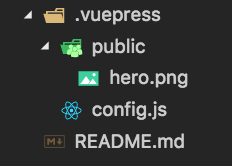
After installing VuePress (globally or locally, as per the docs), you can add a few files and, voila, you have a blog or docs of your very own, simply by adding a README.md file in a folder and typing vuepress dev in a terminal from the root. Add a few more files, and you start to have something very decent looking:

I've created a very simple Vuepress site as shown above, done with a total of two folders and three files:
This extremely simple VuePress site is available here: install VuePress, cd to this repo, and type
vuepress dev.
The only problem with VuePress is, similar to Wordpress, web sites generated with these tools tend to look quite boilerplated: "VuePressy", as I like to say. What if we could use VuePress's powerful static site generation AND style a website to look totally custom? Enter Tailwind.css, the new kid on the block enjoyed by web developers for its non-judgmental styling that just works.
Why Tailwind?
Tailwind is a different kind of CSS framework that styles itself "a utility-first CSS framework for rapidly building custom user interfaces." Unlike Vuetify, Bootstrap, Bulma or other major styling frameworks on the market, Tailwind is not about adding components to your web site like a UI kit. It's not opinionated and has no default theme or built-in components. If you want full control over how your web site looks, while also needing to avoid writing all your CSS by hand, Tailwind might work well for you.
Bonus - Tailwind.css works on mobile, too, with your NativeScript-Vue mobile app. Stay tuned for a tutorial.
Let's get started on this project by creating a boilerplate VuePress site. You can use the sample I created above as a template.
Install Tailwind.css
Now, it's time to install Tailwind.css. Since Tailwind needs to be installed as an npm package, we're going to need a package.json file in the root. Create one in the root folder of your project, and add the following elements, editing to personalize the project:
{
    "name": "MyBlog",
    "version": "1.0.0",
    "description": "A new Blog",
    "repository": {
        "type": "git",
        "url": "git+https://github.com/your-github-handle/blog.git"
    },
    "keywords": [
        "keywords"
    ],
    "author": "your-name",
    "license": "MIT",
    "bugs": {
        "url": "https://github.com/your-github-handle/blog/issues"
    },
    "homepage": "https://github.com/your-github-handle/blog/#readme",
    "devDependencies": {
        "tailwindcss": "^0.7.3",
        "autoprefixer": "^9.4.2",
        "postcss-import": "^12.0.1",
        "postcss-loader": "^3.0.0"
    }
}
Yarn install or npm install the packages. What's going on here? Well, we added the Tailwind package, and also an autoprefixer, the postcss-import, and the postcss-loader because these packages are necessary for VuePress to consume Tailwind css.
The next step is to create a Tailwind config file. Do this by typing, from the root folder, ./node_modules/.bin/tailwind init tailwind.js. Let's take a look at the file generated by this command. We notice right away that it's really long, over 900 lines. In it are the settings such as default colors that ship with Tailwind. You'll find things such as 'red': '#e3342f'. You use these presets in your css to quickly style elements: <p class="text-red">. Since this file is so long, you might want to delete parts of it to make it a bit lighter weight; customize this file as per your preference. You can install it without the comments, for example, which will shorten it.
Tip: follow these instructions to shrink the file using PurgeCSS. Thanks for the tip, @ohffs!
Next, we need to make these styles able to be picked up by your website. We're going to use this file in the context of VuePress, so let's get VuePress set up for custom theming.
Create a Custom Vuepress Theme
VuePress ships with its own default look-and-feel, and we know we want to override that, so we must create a new folder in .vuepress called theme along with a file called Layout.vue. In that folder add a folder called styles and add a theme.styl file into that folder. Your folder structure now looks like this:
Why use Stylus via that theme.styl file? You don't have to use Stylus, but it's used in the VuePress docs so I continued using that pattern.
Edit Vuepress to support Tailwind
Now, you need to make Tailwind available for VuePress. There are a couple of things that have to be done to make them play nicely together.
First, in .vuepress/config.js, edit the code to use postcss to import the tailwindcss plugins and config file. The entire config.js file now looks like this:
module.exports = {
    postcss: {
      plugins: [require('tailwindcss')('./tailwind.js'), require('autoprefixer')],
    },
    title: 'Hello VuePress',
    description: 'Just playing around'
  }
Next, edit .vuepress/theme/styles/theme.styl to import the tailwind preflight and utilities classes. Add these two lines to the .styl file:
@tailwind preflight;
@tailwind components;
@tailwind utilities;
Finally, edit .vuepress/theme/Layout.vue so that the new layout file can pick up the new styles:
<template>
<div>
    <p class="text-red">hi</p>
</div>
</template>
<style lang="stylus">
    @import './styles/theme.styl';
</style>
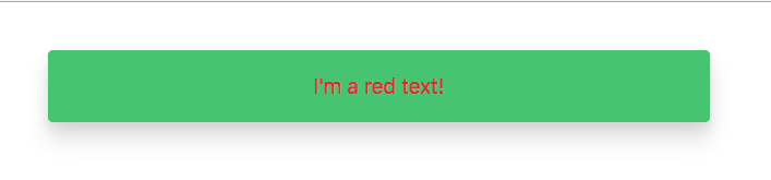
Restart your dev server (Ctrl-C to stop it, then vuepress dev to restart it) and take a look. It's not very pretty, but you can see a distinct style that wasn't there before: a red colored text.
Learn how Tailwind styles your markup by playing a little with this file. If you edit the markup just a bit:
<div class="rounded shadow-lg w-1/2 m-10 p-5 bg-green">
    <p class="text-red text-lg text-center font-sans">I'm a red text!</p>
</div>
You can see a colored card has been added to your webpage:
You added:
- a container div with several classes that produced a rounded box (
rounded) - with a large drop shadow (
shadow-lg), - width set as half the viewport (
w-1/2), - with margin of 2.5rem all around (
m-10) and - padding 1.25rem all around (
p-5), - finishing with a green background (
bg-green).
Inside, you styled the text as:
- colored red (
text-red), - sized large (
text-lg), - centered (
text-center), - with a sans-serif font (
font-sans).
Getting an idea how Tailwind works? It gives you a great deal of control over your look and feel, while providing sensible defaults.
This version of the site is available to view here.
Making the Most of VuePress within a Tailwind Context
Now that you have fine control over your styling, you need to start making some architectural decisions. How much of your site will be .vue files, with plain HTML markup and hard-coded text, and how much will be VuePress-friendly markdown? The two architectures can often seem to be antithetical as it seems like an antipattern to style markdown via HTML tags. I find that it helps to think of your Tailwind-styled .vue files as a container or shell for your VuePress markdown. If you are disciplined about keeping all your text in markdown, it will be easier to maintain your blog, especially if you decide to localize your content.
While working on the new version of my web site, I've had to continually make decisions like this. With the goal in mind that we want to keep our text in markdown, and our HTML in .vue files, let's evolve our custom web site theme a little further.
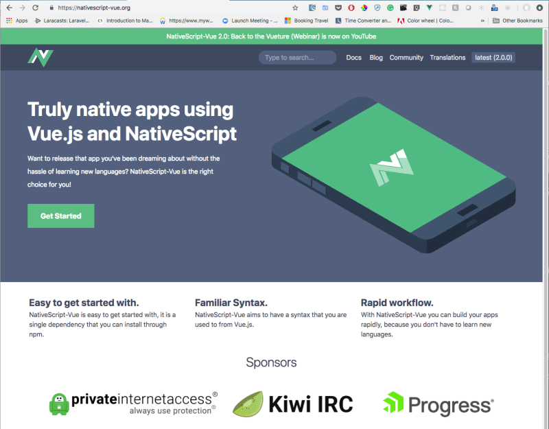
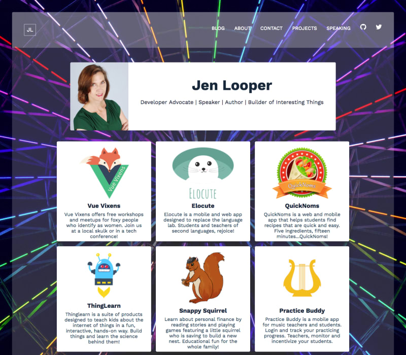
For the next few tips on integrating these two resources, I'm going to turn to my experiences working on rewriting NativeScript-Vue.org. I'm also rebuilding jenlooper.com to look like this:

The Challenge: Multiple Layouts with VuePress and Tailwind
Once you move past the creation of a very simple VuePress site with a few routes and one basic themed layout, you quickly get into the weeds of leveraging the best of VuePress and Tailwind without getting entirely lost. Let's walk through creating a totally custom-looking web site with two different layouts, namely my web site, currently being reconstructed. You can follow along in this project here.
The idea of this personal website is to showcase my projects and provide a space for my articles, which are admittedly scattered around several sites (Telerik Developer Network, NativeScript Blog, Progress Blog, and Dev.to). The initial page will be a showcase of project cards, and inner pages will provide an area for links and various other informational pages. The components can be broken up into at least two layouts - HomeLayout and BlogLayout. In addition, there are some components nested inside those, namely a Cards component and a Nav and Footer. Pretty standard stuff: the HomeLayout will include the Cards, and the BlogLayout will not. The challenge here is to enable markdown to populate all the areas of the website so as to keep that important separation between text and HTML markup.
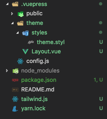
The first order of business is to create two new folders in .vuepress/theme: components and layouts. Create any new components as .vue files and put them in the components folder, and do the same in the layouts folder. My .vuepress folder's structure now looks like this:
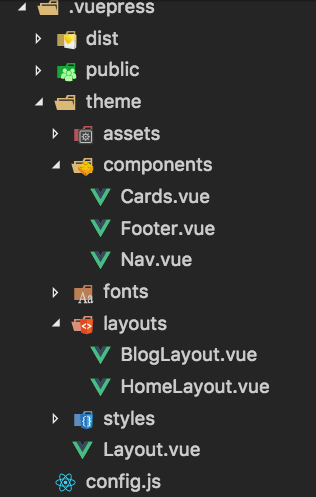
Then, extend .vuepress/theme/Layout.vue to support multiple layouts. They key is to remove the <Content/> tag from the mandatory Layout.vue file and use a smarter component tag that changes according to the layout specified in markdown frontmatter. The <template> block in the Layout.vue file, then, changes to look like this:
<template>
<div class="wrapper">
    <div class="markdown-body m-10 rounded">
        <Nav/>
        <component :is="layout"></component>
        <Footer/>
    </div>
</div>
</template>
Then, add a <script> block to import the custom components and new layout files. For my site, it looks like this:
<script>
import Nav from './components/Nav.vue';
import Footer from './components/Footer.vue';
import HomeLayout from './layouts/HomeLayout.vue';
import BlogLayout from './layouts/BlogLayout.vue';
export default {
    components: { Nav, Footer, HomeLayout, BlogLayout },
    computed: {
        layout() {
        return this.$page.frontmatter.layout || 'HomeLayout'
        }
  },
}
</script>
The computed property layout() checks a given page's frontmatter for its specified layout, and assigns it accordingly. Now you can start customizing your layouts in a more granular way.
Since we are bypassing VuePress's standard ways of creating layouts via frontmatter, we have to specify the Tailwind styles for each element on the page. That's the price you pay for avoiding boilerplate, but it's worth it!
Build your Layouts
Let's look at the layout I'll use for most inner pages. The BlogLayout.vue page in my site now contains the <Content/> tag expected by VuePress for displaying markdown. In this page, for example, I add a few styles to surround the generated markdown:
    <template>
        <div class="blog-body bg-white rounded m-10 text-blue-darkest">
            <div class="p-10">
                <h1 class="pb-5 text-blue-darkest">{{$page.frontmatter.title}}</h1>
                <Content/>
            </div>
        </div>
    </template>
    <script>
    export default {
        name: 'BlogLayout'
    }
    </script>
VuePress can then find a given route's markdown file - by default, they are presented as a folder plus a README.md file. For example, my About page uses the BlogLayout file for its display. The README.md file in /about just contains a bit of frontmatter and some text:
---
title: About Me
layout: BlogLayout
---
Welcome! I'm a Google Developer Expert for Web Technologies and a Senior             Developer Advocate at Progress with over 15 years' experience as a web and mobile developer, specializing in creating cross-platform mobile apps. I'm a multilingual multiculturalist with a passion for hardware hacking, mobile apps, Vue.js, machine learning and discovering new things every day. I'm also the founder and CEO of Vue Vixens, an initiative promoting diversity in the Vue.js community. Contact me here or on Twitter @jenlooper.

Our Privacy Policy can be found [here](/privacy-policy)

Looking to contact me? Email me at jen @ ladeezfirstmedia.com. My resume can be found [here](https://standardresume.co/JenLooper).
VuePress lays out the site and Tailwind handles its styling. But what if you aren't quite satisfied, and want to assign styles to the <p> tags generated by VuePress?
You could add HTML tags into your markdown, but remember, we're trying not to do that. Instead, leave the markdown alone, and use Tailwind's @apply directive to assign Tailwind styling to your generated HTML by adding a snippet to your theme.styl file:
    @css {
        .blog-body p {
            @apply .pb-5;
        }
    }
Note, normally you can add
@applyto CSS classes without the@cssmarker but there seems to be an issue with Stylus files, such that@applyis not always used.
Example 1: About
Another example of finding a good balance between using frontmatter and HTML is found in the card interface that I built in .vuepress/theme/components/Cards.vue. Here, since these cards are displayed on the homepage, I used content derived from the root README.md file. Frontmatter is infinitely flexible, so I created a new array of card content in README:
   cards: [
        {'title': 'Vue Vixens', 'image': 'vuevixens_logo.png', 'blurb': 'Vue Vixens offers free workshops and meetups for foxy people who identify as women. Join us at a local skulk or in a tech conference!','link':'https://www.vuevixens.org'},
        {'title': 'Elocute', 'image': 'elocute_logo.png', 'blurb': 'Elocute is a mobile and web app designed to replace the language lab. Students and teachers of second languages, rejoice!','link':'http://www.elocute.me'},
       ...
    ]
To display this content, I looped through the array in Cards.vue, picking out each element and surrounding it with styles:
    <template>
    <div class="flex flex-wrap pt-5 m-2 justify-center">
        <div v-for="item in $page.frontmatter.cards" class="w-1/4 m-2 cursor-pointer bg-white max-w-sm rounded shadow-lg text-center" @click="goToRoute(item.link)">
            <img class="pt-5" :src="'./images/'+item.image+''" :alt="item.title">
            <div class="px-6 py-2">
                <div class="text-blue-darkest font-bold text-xl mb-2">{{item.title}}</div>
                    <p class="text-blue-darker">
                        {{item.blurb}}
                    </p>
                </div>
        </div>
    </div>
    </template>
Example 2: Nav
You aren't constrained to using page-level markdown content; for my Nav.vue navigation component, I turned to my site-level config.js file which contains a Nav object that I leverage to build the universal navigation:
    <span v-for="item in $site.themeConfig.nav" >
        <a :href="item.link" class="block m-4 lg:inline-block lg:mt-0 no-underline text-white hover:text-orange uppercase">
          {{item.text}}
        </a>
    </span>
Conclusion
Updating my site from now on is going to be a dream. No more excuses about maintainability and brittle design! Once your layouts are in place, and you have decided on the content within your markdown files, you have in hand a very solid architecture to build beautiful, scalable, easy-to-maintain websites. Enjoy, and add your tips and tricks on marrying VuePress and Tailwind below.


