 Mads Stoumann
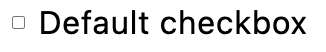
I'm probably not the only developer who's frustrated about the browser's default <input type="checkbox">.
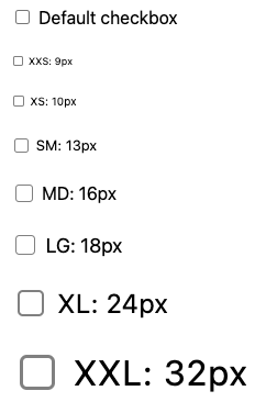
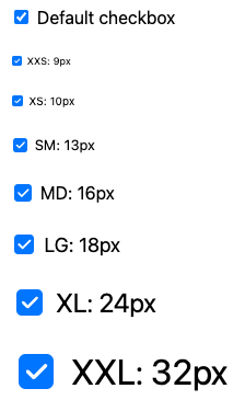
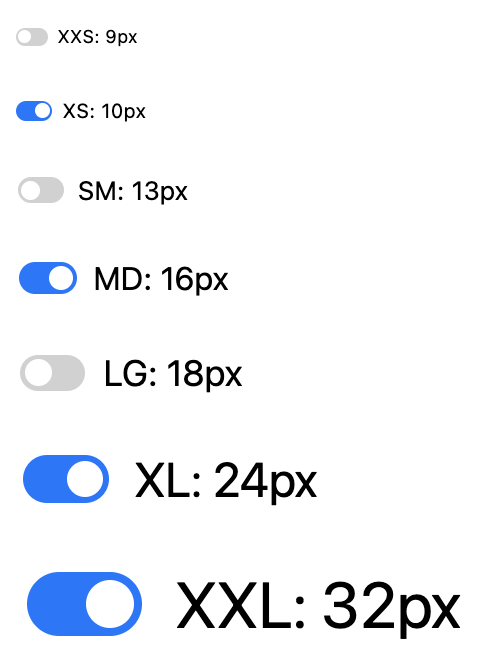
First of all: it's not scalable. In this example, the font-size has been scaled up to 200%, but the checkbox remains at it's root size, which is 13.333333px:
In this tutorial, we'll be dissecting the browser's default checkbox, and see, if we can do it better.
First, we need to clear the default styling using appearance:none and set an initial size — which will be a relative unit, em:
[type=checkbox] {
  appearance: none;
  aspect-ratio: 1;
  box-sizing: border-box;
  font-size: 1em;
  width: 1em;
}
The background-color should adapt to dark mode, so we'll check if it matches any of the system colors. It seems to match the Field system-color, so let's use that.
For the border-color — in Chrome — it matches the system color ButtonBorder, but since Safari use a much lighter ButtonBorder, we'll use GrayCanvas which works in both browsers.
We'll add a few CSS Custom Properties, which we'll use to create variants later.
For border-radius and margin, we'll be using the default values, but convert them to the relative unit em.
The border-width seems to scale using this formula:
(4/3) / root size
Since root size is 13.333333px, we now have:
[type=checkbox] {
  --_bdw: calc(1em * (4/3) / 13.333333);
  appearance: none;
  aspect-ratio: 1;
  background: var(--_bg, Field);
  border: var(--_bdw) solid var(--_bdc, GrayText);
  border-radius: var(--_bdrs, .2em);
  box-sizing: border-box;
  font-size: 1em;
  margin: var(--_m, .1875em .1875em .1875em .25em);
  position: relative;
  width: 1em;
}
Let's see if it's scalable:
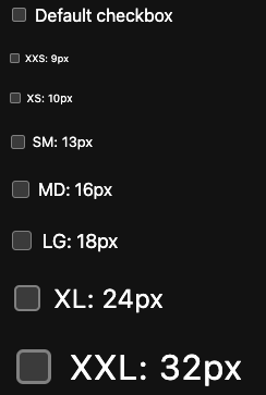
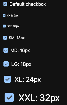
Nice! What about dark mode?
That's why I love system colors! Next, let's add the same hover-effect the browser uses on an unchecked checkbox.
We'll mix-in CanvasText, which is black in light mode, and white in dark mode, and simply update the --_bdc-property we added in the previous step:
@media (hover: hover) {
  &:not(:checked):hover {
    --_bdc: color-mix(in srgb, GrayText 60%, CanvasText 40%);
  }
}
The Checkmark
And now for the checkmark. We could do it with a rotated CSS box in the ::after-element:
[type=checkbox]::after {
  border-color: GrayText;
  border-style: solid;
  border-width: 0 0.15em 0.15em 0;
  box-sizing: border-box;
  content: '';
  aspect-ratio: 1 / 1.8;
  rotate: 40deg;
  width: 0.375em;
}

While this works fine, I prefer to use an SVG in a mask, simply because it's more flexible. For that, we'll add a property fot the mask and another, --_bga for the background of the ::after-element, which will be the color of the checkmark.
[role=checkbox] {
--_bga: Field;
--_mask: url('data:image/svg+xml,<svg xmlns="http://www.w3.org/2000/svg" viewBox="0 0 24 24" stroke-width="3" stroke="%23000" fill="none" stroke-linecap="round" stroke-linejoin="round"> <path d="M5 12l5 5l10 -10"/></svg>');

  &::after {
    background: var(--_bga, transparent);
    content: "";
    inset: 0;
    position: absolute;
    mask: var(--_mask) no-repeat center / contain;
    -webkit-mask: var(--_mask) no-repeat center / contain;
  }
}
So, we do have a checkmark now, we just can't see it, as the mask-color is set to transparent.
Let's update the checkbox's color when clicked, using the :checked-state. But before that, we need to figure out which color!
Safari is the only browser that supports the system color AccentColor, so we need to create out own variable for that, --_accent, which on Mac corresponds to #0075ff:
[type=checkbox] {
  --_accent: #0075ff;
  &:checked {
    --_bdc: transparent;
    --_bg: var(--_accent);
    --_bga: Field;
  }
}
Let's see what we've built:
And dark mode? We need to update the --_accent-property first, since AccentColor isn't working in all browsers yet:
@media (prefers-color-scheme: dark) {
  --_accent: #99C8FF;
}
Let's check:
Cool! Now all we have to add is the :checked:hover-state, which is similar to the border-hover, we added earlier:
@media (hover: hover) {
  &:checked:hover {
    --_bg: color-mix(in srgb, var(--_accent) 60%, CanvasText 40%);
  }
}
Let's compare how it looks in Chrome, Safari and Firefox:
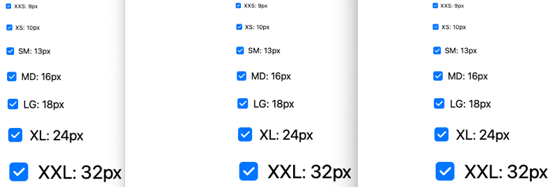
Seems we passed the test!
Variants
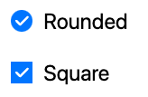
Creating variants is super-simple: you just need to update a few properties. Example:
.rounded { --_bdrs: 50%; }
.square { --_bdrs: 0; }
And then in HTML:
<input type="checkbox" class="rounded">
<input type="checkbox" class="square">
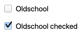
— or go all-in and create oldschool checkboxes:
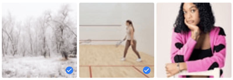
A note on round checkboxes: It's bad practice, as you can read in this wonderful article. There are a few exceptions, though, as this "image selector":
Switches
For switches, we'll add a role="switch", so it's:
<input type="checkbox" role="switch">
Apple have recently added their own switch-control, but role="switch" is cross-browser. Again, we just need to update a lot of the properties, we created earlier:
[role=switch] {
    --_bdc--hover: transparent;
    --_bdrs: 1em;
    --_bg: #d1d1d1;
    --_bga: Field;
    --_mask: none;
    aspect-ratio: 1.8 / 1;
    border: 0;
    display: grid;
    padding: .125em;
    place-content: center start;
    width: 1.8em;
    &::after {
      border-radius: 50%;
      height: .75em;
      inset: unset;
      position: static;
      width: .75em;
    }
    &:checked {
      --_bg: var(--_bg--checked, var(--_accent));
      justify-content: end;
    }
  }
That gives us:
Demo
And that's it! Below is a Codepen with demos:
Hacks and Stitches
The following is a collection of stuff I've done with checkboxes on Codepen:
Checkbox Cinema
Pick your seats. Can also be modified to pick seats on a train, a plane …
Skyline Checkboxes
Turn on the lights in the flats by clicking the windows …
Paint-By-Numbers
Pick a color first (using <input type="radio">), and then click on the corresponding number (checkboxes) …
Dot-To-Dot
Does not requre JavaScript, but I've left it there for you to play …
Terms and Conditions from Hell
Check them all …
The Daily Toggle
Alvaro Montoro is creating a huge collection of switches/toggles — one per day for 2024. Check them out here.
Cover Photo by Tara Winstead


