 GrahamTheDev
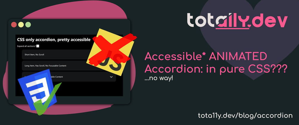
A few days ago I designed an accordion in 1 minute, 5 minutes and 10 minutes that was far more accessible than most! (perfect? not quite, but certainly usable by assistive tech users and keyboard only users).
But the thing that annoyed me was that I HAD to use JavaScript in order to make the animation work.
And we all know how much people love CSS only things (don't get me started on people who build their sites using React or Vue and then want CSS only stuff...)
Update
Please note, I made a couple of major blunders here, which, as someone who calls themselves an accessibility expert are embarrassing. Hence why the title now says "nearly accessible"...I was close, but failed!
However, I am happy to hold my hands up when I am wrong.
A few things to consider:
- This does not work in Firefox due to the use of
:has. I am looking at refactoring the code so it does not rely on:has, but for now this means it is not fit for production without a polyfill (which kind of defeats the purpose as this is meant to be no JS!). - Due to the use of links the behaviour may not be as expected when using a screen reader. I personally was aware, but I certainly did not put enough emphasis or thought into it. I am going to update the CodePen to account for this as much as possible.
- This pattern will update the browser history every time you open a section due to the use of fragments. This is not good UX! Thanks to @starkraving for pointing that out.
Because of this, I need to upgrade the advice I originally had (a last resort pattern) to a "do not use this pattern in production!".
Instead use this as a learning resource on CSS techniques you may find useful in some scenarios.
My apologies for missing some obvious things that I should have caught, I will double my efforts to ensure I do not mark something as accessible when I should know better.
Special thanks to @merri for setting me straight and taking the time to point out my blunders, it is appreciated!
I will update this article further as I rethink and improve things, I may be able to reclaim it as "accessible"...but I will certainly make sure I got it right this time if I do! 💗
Accordion Demo
Try it with your keyboard! Tab between sections, use up and down arrow keys for scrolling the scrollable sections (or on mobile just drag!) and you can even open all the sections with the checkbox!
Above all, have a poke around the CSS and HTML and see what you notice!
It may looks simple at first, but there is a lot going on here!
Here are the most interesting parts:
- using the
:targetattribute to ensure only one item is open at a time. - using a CSS
grid"hack" to allow us to have animated sections that can be any height (this is something that used to be difficult!) - Another hack (this time a real hack) to allow us to display scroll bars only if the content requires it, while not showing up as the section expands.
- The use of
prefers-reduced-motionto remove the animations using a simpleCSS varpattern. - A simple
@media printmedia query that this pattern supports and other accordion patterns don't to open all the panels for printing (and allow them to expand without height restriction so everything is printable)! - A checkbox to open and close all accordion sections if desired.
So, let's look at each of those parts!
The :target attribute
This attribute is an interesting one, in fact, it is the whole reason this accordion works at all!
It allows us to select something with CSS as long as it has the same ID as the hash at the end of the URL.
OK, so that might not make sense immediately, so let me explain.
Let's say we have a div with id="blue".
We can create a CSS selector as follows:
div{
  background-color: red;
}


div:target{
  background-color: blue;
}
So when we load our page to it's default URL (e.g. example-site.com) that div will be red.
But, if we update our URL to be example-site.com*#blue* then that div will turn blue!
And there is a simple way to update the URL, we can use an anchor <a> tag and set the href equal to that ID (<a href="#blue">).
I have put that all together in a simple CodePen. Note that the JS is just to show the URL of the CodePen as you cannot see it. Pay attention to the end of the URL as you click on the links.
We can take advantage of this to make our accordion exclusive!
By assigning an ID to each of the accordion "sections", and then using an anchor (<a>) tag with that href, we now have a way of selecting just one section in CSS and not the others.
Then, if we click on a link that belongs to another section, the selector will target that section instead.
The relevant code from the demo (simplified) is as follows:
HTML
<a href="#acc1">Section 1 "Heading"</a>
<section class="content" id="acc1">
  <p> The content </p>
</section>

<!-- the `href` matches the `id` of the section below it. -->
<a href="#acc2">Section 2 "Heading"</a>
<section class="content" id="acc2">
  <p> The content </p>
</section>
CSS
.content{
  display: none;
}

.content:target{
  display: block
}
And putting that all together you should now hopefully understand the :target property behaviour!
One bonus to this!
There is another bonus to using fragment identifiers (the name for hashes at the end of URLs) that we update with an anchor element...it allows us to move the focus on the page!
When we add #acc1 to the URL the page jumps to the section with the same ID. This comes in useful in this instance as we may have a scrollable area that we want people to be able to scroll up and down with the arrow keys.
Moving focus there means that when the accordion opens, they can use the up and down arrow keys right away without having to Tab to the scrollable section.
A nice quick UX win!
CSS grid for height animation
If you have ever tried to animate the height of an item that isn't a fixed height...you will have experienced frustration and pain.
"Can't I just animate the height"...nope, that won't work?
"What about the max-height animation?" - kind of works, but animation times will vary depending on the height of each item and you end up with strange delays (as the whole max-height is animated, even if you only use a small part of it).
No, this used to be a problem that was only solvable properly with fixed heights or JavaScript.
But, grid is a thing now...and grid can finally give us what we need!
thankyou grid rows and visibility: hidden!
So what is the magic sauce for animated opening?
First of all: grid-template-rows: min-content 0fr
Wait...what does that mean?
-
grid-template-rowsallows us to define how the rows in a grid should behave. Each space delimited entry corresponds to a row in order. -
min-contentmeans that this row should be as small as possible to show the content. If we used it on columns on a paragraph (instead of rows) then the longest word would end up being the width of the container and words would wrap accordingly. Think of it as "as small as possible" in the given direction! -
0fris the last part, we are saying that for the second item in the DOM order, make it "zero fractions" (fr="fraction").0fr. This will make it as small as possible and only visible if it is visually showing.
And that last part is why we need visibility: hidden on whatever item we want to expand / collapse. That hides the item visually, but it still takes up space in the DOM.
So, as a last step, we have to do an overflow: hidden on it to make sure it collapses and margin: 0 and padding: 0 to make sure that the margins and padding do not take up space and it all works!
Now, before I show you that it works, we need to do one last thing, we need to animate the expansion of the element!
two last steps!
So the last thing we need to do is reverse the hiding and make the revealing item take up it's full height, then we can animate it!
So obviously, visibility: hidden needs to become visibility: visible so we can show the revealing item.
And then we need to change the parent so that we have:
grid-template-rows: min-content 1fr
With the change being 1fr (1 fraction) instead of 0fr. In this case that means "take up the remaining space". As our grid has no set height, this will become the total height of the element we want to reveal.
Now, we finally have the parts to animate it!
You see, even with the 0fr the height of the element was already calculated (which is different to that of max-height), so the browser knows what height to animate to...and this is what all of this jumping around with grids and fractions and template rows is for!
We can now animate grid-template-rows!
So to round us off, we need to apply a transition CSS property. In this example of 1 second.
transition: grid-template-rows 1s;
Putting it all together!
So by combining the visibility-hidden, template-rows and transition we have a working opening section that will work at any height!
Check it out!
There is one nuance here you may have noticed, :has.
This is like saying "if the item inside :has appears inside this element, then select this item"
We need this so we can change the grid-template-rows on the parent easily.
.grid-rows:has(p:target) effectively says "select the element with the class grid-rows if there is a <p> element inside that matches the :target selector (that we discussed earlier in this article).".
This way we can toggle our grid-template-rows property when needed.
phew, that was a lot, let's look at some hacks now to make it more fun!
Scrollbars only showing after animation
As this is a hack, I won't go into as much detail, but I had a problem.
In the final demo, I restricted the height of the content section (so that the next accordion section is visible on screen, even on long content sections, for better UX).
Now the problem is that I am animating the height. So as the section expands, there are parts that will overflow and trigger scroll bars.
This would be fine, except that some sections in the demo accordion do not require scroll bars (as they are shorter than the max height I set).
This results in some horrible UI / UX where the scroll bars momentarily appear while the section expands and then disappear afterwards, as can be seen in the following GIF.

Ewwwww...hate it!
Now, scroll bars are strange. If we start them off invisible (overflow-y: hidden) and then animate them to visible (overflow-y: auto), they disappear again once the animation is over.
So, I hacked it!
I set a very long animation duration and made them visible very early in the animation.
animation-duration: 1000s;
animation-name: show-scroll;

@keyframes show-scroll {
    0% {
        overflow-y: hidden;
    }
    0.2% {
        overflow-y: auto;
    }
    to {
        overflow-y: auto;
    }
}
Here we animate over 1000 seconds, but we change to the final state at 0.2% of the animation (2 seconds).
So after 16min 40 seconds, this scroll bar will disappear, but I think that is acceptable here (as acceptable as possible with a hack at least lol).
I am sure there is a way to achieve this, but sometimes you just have to ship to production with something that is 95% good enough!
Now we get scroll bars that are hidden initially, and then appear once the expanding animation has completed.
One final note: if someone did sit with the page open for 17 minutes and the scroll bars disappeared, they would reappear when they expand the section again and the section would still be scrollable. This is why I say this solution is "good enough" as that will be a rare occurrence and it self fixes on interaction!
prefers-reduced-motion the easy way
In my previous article about accordions I covered prefers-reduced-motion as well.
It means that for people who need reduced motion on a page (people who may become dizzy or ill through movement due to vestibular disorders for example) have a way of indicating that they would like less animation to us.
In the previous article I was using JavaScript to check for this media query. But as prefers-reduced-motion is designed for CSS primarily, it is waaaaay easier in CSS.
So what we want to do is this:
- default to animations
- if someone has
prefers-reduced-motion: reduceset as a preference in their browser, then reduce or remove that animation.
Now here is the "trick" to make this easy.
set your animation durations as CSS properties.
That way, we only need to toggle the animation duration in one place and we can update it in multiple places.
Like this:
/* the ":root" element is essentially the "top level" or "global" place where you can define CSS properties etc.
:root {
    --open-duration: 0.5s;
}

/* we use our CSS var in place of a static duration.
.some-item-to-animate{
  transition: grid-template-rows var(--open-duration);
}


/* we can use that same duration in multiple places
.some-other-item-to-animate{
  transition: grid-template-rows var(--open-duration);
}

/* we check for `prefers-reduced-motion` with a @media query and update the CSS variable if it matches.
@media (prefers-reduced-motion) {
    :root {
        --open-duration: 0s;
    }
}
By setting the animation to "0s" that effectively switches the animation off!
Side note / tip
By using calc you can actually create a toggle for animations across a whole site from a single CSS variable.
I am not going to explain this fully as it is outside of the scope of this article, but the following CSS may help you understand how it works!
:root {
    --animations-on: 1; /* 1 = yes, 0 = no, we can toggle this with a media query like the previous example */
}

/* animation takes 2 seconds (assuming --animations-on = 1) */
.some-element-with-animations{
    --duration: 2s; /* local animation duration */
    transition: [item to transition]
                calc(var(--duration) * var(--animations-on));
}

/* animation takes 4 seconds (assuming --animations-on = 1) */
.some-element-with-animations{
    --duration: 4s; /* local animation duration */
    transition: [item to transition]
                calc(var(--duration) * var(--animations-on));
}
Hopefully that little tip can give you some interesting ideas on how to allow user settings etc.
Expand all sections for printing with @media print
Another media query tip / trick...and one that works well with this pattern for an accordion over the <details> and <summary> one I shared in my previous article.
The @media print media query will apply styles only when someone prints the page (this includes "print to PDF" in case you are thinking nobody will ever print your page lol!)
All we need to do is apply the "open state" CSS to every single .content section in our demo
@media print {
    /* our parent item */
    .tota11y-accordion > li {
        grid-template-rows: min-content 1fr;
    }

    /* the item that expands */
    .tota11y-accordion > li .content {
        visibility: visible;
        margin: 0.5rem 1rem 2rem 1rem;
        padding: 0.5rem;
    /* in our demo we set a `max-height` on elements so they are scrollable sections. We do not want that in print so we set it back to `none` so the sections can expand indefinetely */
        max-height: none;
    }
}
Read more about [media queries and the print media query on MDN (second item in "description" section)[https://developer.mozilla.org/en-US/docs/Web/CSS/@media#description]
Allow users to open and close all sections with a checkbox
One last "win" for this pattern over <details> and <summary> is that we can open and close all sections using just a checkbox.
We apply the exact same principles as those of out @media print CSS query, but this time attach it to the :checked state on a checkbox.
And one last thing, this time we do not change the max-height as we don't want to remove the scrolling sections this time!
#tota11y-open-close:checked ~ ul>li{
    grid-template-rows: min-content 1fr;
}

#tota11y-open-close:checked ~ ul>li>.content{
    visibility: visible;
}
So we have a checkbox input (<input type="checkbox" id="tota11y-open-close">) with an ID oftota11y-open-close`.
We position it as a sibling (on the same level in the DOM) as the <ul> that contains each of our accordion sections.
This way we can use the tilde ~ operator to do some matching based on the :checked state (which is like a boolean, checked = true, not checked = false).
So we check the state first, then if it is checked, we select the sibling ul, and any li within it to toggle our grid-template-rows (the li are the parent items we discussed earlier in each accordion section).
We also need to update the content section (the child section discussed earlier). But this time notice we use the > operator?
That is so that we only select matches that are directly related to each other in the DOM order (any li must be a direct child of the ul and the .content section must be a direct child of the li).
This is just so that we don't "pollute" the .content section (as if we added a <div class="content"> within our original content section that would also get selected otherwise. It is an edge case, but it just makes it more robust.
One last thing to think about.
I just mentioned "polluting" other sections. What I mean is that many people apply styles in CSS that are not specific enough. Due to how CSS "Cascades" (the "C" part of "CSS"), this can sometimes result in styles "escaping" and affecting elements they should not.
To avoid this (so you can use this accordion in your own projects) I have scoped all of the selectors with .tota11y-accordion.
That means the styles cannot escape the surrounding div with that class.
That is a useful tip to remember, if you create a component, have a class on the outer most element that you include in all selectors. This will keep the styles scoped within that component and will make your CSS easier to maintain (even if it is a little more verbose!).
Oh and just have a quick look at the aria attributes I used in the demo again and have a read around those, it never hurts to level up your accessibility knowledge! 💪🏼💗
Wrapping Up!
There was a lot in that and I hope you learned some new tips and tricks for CSS.
As I said at the beginning, do not use this pattern in production unless you absolutely MUST avoid JavaScript. But also keep the pattern and techniques in mind as they may just save your bacon one day!
If you enjoyed this article, consider leaving a 💗 (or more emojis if you are feeling generous!) as it really helps!
And if you learned something new, then let me know in the comments, that would be amazing!
See you in the next one all of you beautiful people (and fellow monsters)! 💗


