 GrahamTheDev
Awww shi...here we go again.
Yes I am back, breaking the internet once more. I know, it has been a while.
But this time...I may have come up with something kind of useful?
We will see!
First of all, the title is not clickbait.
I have actually built a (buggy) syntax highlighting system, that uses just a single element and can function in pure CSS (for displaying snippets).
No <span> elements for each different part of syntax that is highlighted, no bulky JavaScript libraries to render everything.
Sounds interesting? Let's jump right in with a code example:
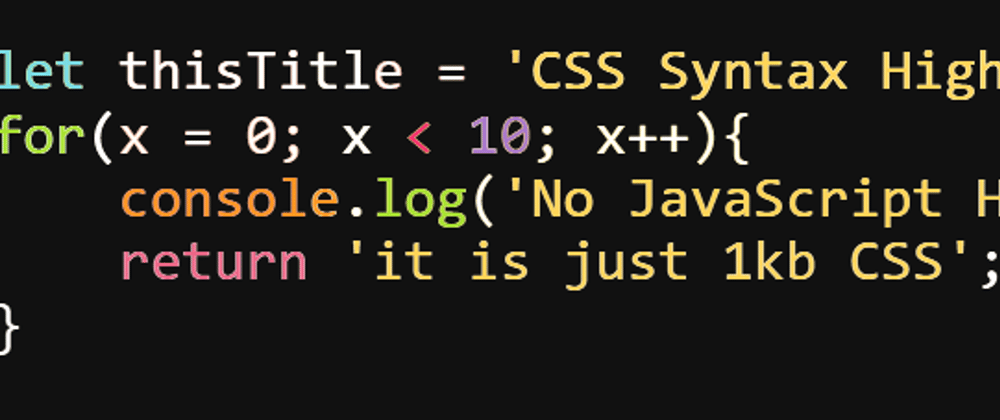
An example
Look at this beautiful syntax highlighting!

All done in less than 1kb of code!
Here is the HTML:
<pre>
let thisContent = 'highlighted';
for(x = 0; x < 10; x++){
console.log('loopy loopy loop' + x);
}
</pre>
Note: Please use <pre><code> for marking up code blocks in production.
And here is the CSS:
body{
    background-color: #111;
    padding: 20px;
    color: white;
    font-size: 125%;
}

pre{
    width: 80ch;
    font-family: monospace;
    font-size: 30px;
    line-height: 30px;
    background:
        linear-gradient(to right, white 0ch, #78dce8 0ch, #78dce8 3ch, white 3ch, white 18ch, #FFD658 18ch, #FFD658 31ch, white 31ch, white 80ch),
        linear-gradient(to right, white 0ch, #a6e22e 0ch, #a6e22e 3ch, white 3ch, white 12ch, #f92672 12ch, #f92672 15ch,  #A7C 15ch,  #A7C 17ch, white 17ch, white 80ch),
        linear-gradient(to right, white 0ch, white 0ch, white 4ch, #fd971f 4ch, #fd971f 11ch, white 11ch, white 12ch, #a6e22e 12ch, #a6e22e 15ch, white 15ch, white 16ch, #FFD658 16ch, #FFD658 34ch, #f92672 34ch, #f92672 37ch, white 37ch, white 80ch),
        linear-gradient(to right, white 0ch, white 0ch, white 80ch),
        linear-gradient(to right, white 0ch, white 0ch, white 80ch);
    background-repeat: no-repeat;
    background-size: 80ch 30px, 80ch 60px, 80ch 90px, 80ch 120px, 80ch 150px;
    background-clip: text;
    -webkit-background-clip: text;
    color: transparent;
}
That is it!
So what?
So...highlight.js, one of the leading syntax highlighting libraries is...wait for it...286Kb (and that is minified and gZipped! It is over 980kb of raw JS 😱).
That is a huge amount of JS to push down the wire if all you are wanting to do is show a code snippet with some syntax highlighting.
Yet many sites do this, destroying their performance.
So while the demo may not look that impressive, the 99.8% data saving is pretty impressive!
Explanation: how does it work?
So what we are doing is applying a very carefully created background linear-gradient to the <pre> element, that looks like this:

Each of the coloured blocks corresponds to some text we want to highlight.

Then all we do is use background-clip: text;, a CSS property that allows us to say "hey, can you please use the text above the background as a mask, and only show the background if there is text in front of it, otherwise show a transparent background."
And we end up with this example:
Working Example
But if it is that easy, then why doesn't everyone do this?
The short answer is: linear-gradients and alignment.
To try and align the linear gradient by hand would take a lot of time.
Also, this relies on lines not "wrapping", as otherwise the gradient will not align anymore (although with some clever maths, we could probably account for this! Not part of this demo though).
You see, in order to generate the gradient we need to know:
- how wide each highlighted section to be generated is
- how many lines of text there are
- to know what colour each part needs to be highlighted in.
The second part is straight-forward. But working out the width of each item to be highlighted is hard, working out what to highlight...is really hard!
Luckily...I am silly enough to build a fully working editor, which finds relevant "tokens" within a JavaScript snippet, and then uses these to calculate where each part of the linear-gradient should be.
Wanna try it?
The Snippet generator
Instructions:
- Input: Enter a short JS snippet in the first box(*)
- Preview: Check that the preview is as expected (Preview) (this is a janky setup for highlighting, it may fail on certain snippets).
-
Output: Copy and paste the resulting code from the output section into your code! (Don't forget, this is designed for a dark background, so you need a dark background on either your
<body>element or to create a wrapper around the<pre>element and give that a dark background.
(*) Due to limitations of this demo, please make sure that no line is more than 70 characters in length.
That is it, give it a try below:
Understanding how this works
Look, that JavaScript is a hot mess of cobbled together snippets...I would not expect you to try and follow it.
Here is the simplified version of what is happening though:
- We grab each line in the (input) section and loop through it.
- We use a RegEx (yes...I know) to capture key terms in JavaScript such as
letandfunctionetc. - We then create a linear gradient for each line, with the length of each section of the gradient corresponding to found matches.
- Finally, we adjust the
background-sizeCSS property to account for the height of the given lines of code, so that eachlinear-gradientdeclaration we have lines up with the length and height of each line of code.
That last part might be the most confusing part.
To explain better, think of the following:
let a = 'test';
let b = a + ' your code';
Let's assume that all we want to do is highlight the strings in these two lines ('test' and ' your code').
So we need 2 gradients.
They need to be 25 characters long (the length of the longest line) and we need to have a coloured block appear at:
- character 9 to 13 on line 1
- character 13 to 23 on line 2
These turn into linear gradients as follows:
linear-gradient(to right, white 0ch, white 8ch, red 8ch, red 14ch, white 14ch, white 25ch),

linear-gradient(to right, white 0ch, white 12ch, red 12ch, red 24ch, white 24ch, white 25ch);
Where "red" is our highlight colour and "white" is our non-highlighted colour. (our characters are 0 indexed in case you wonder why the number / position of each character is 1 less).
BUT, if we just tried to use those two gradients on their own, it would fail.

This is because the first gradient has taken up 100% of the height.
So to fix this, we need to set the height of each of the linear-gradient declarations, using background-size.
This would look like this:
background-size: 25ch 22px, 25ch 44px;
Assuming a line-height of 22px (so the first gradient is 22px high from the top, to cover the height of the first line, and then the second gradient is 44px high from the top, to cover the second line. This is because linear gradients stack on top of each other and the one that is declared first is on top).
Oh but it still doesn't work yet.
You see, gradients repeat by default. So we also need to set background-repeat: no-repeat;
Now we get a working highlight on the strings:

And that is essentially it, just add different colours for each type of token and you have a "working" syntax highlighting system in pure CSS with no <span> elements.
But...why?
Ok, ok. You have now read the whole article and are still asking why. That is fair!
To be honest, I just had a silly idea.
But also, I like to take something and use it in a way that was not intended.
I find it is a great way to learn as there are no tutorials I can follow for things like this. I just have to keep trying things and work out how to solve the problem.
It also really helps you learn things more deeply as you need to read the docs and experiment. (for example, I learned a couple of things with linear-gradients that I didn't fully understand before, such as how they stack when you declare multiple linear-gradients as a single background)
So what do you think?
Could this actually become something useful?
Can you imagine generating super light-weight code snippets for documentation as part of the build step, and just serving CSS and a single element?
Although it is a joke project right now, could the concept actually work in production? 🤔
Let me know what you think in the comments. 💗


